This is a tutorial to demonstrate how you can simply use 1 menu, and style it differently on different devices without the need of duplicating your menus!
Here at jSpecialists we always use only 1 menu to display in all of the devices, and with the help of a 'custom module', a small bit of jQuery and CSS we have the ability to style the same menu however we like.
For this demo and guide, we have opted to use one of the default joomla templates (Protostar), a simple single tier navigation, with a 'hamburger' button on mobile devices. We will also be using some 'Font-Awesome' icons. We have set up a mini demo site here: https://www.jspecialists.com/demo-home
So …. Let's get started
First up, the Custom Module, Creating the ‘custom module’
We will start by creating the ‘custom module’. This will be where the Hamburger Mobile button will be placed.
- Go to Extensions > Modules, click 'New' and locate the 'Custom' module type.
- Fill out the required details in the Module tab, as below:
- Add a Title (can be anything you like, as we will hide this off)
- Set Show Title to Hide
- Choose the Position, usually you will want to display this top right. So for default Protostar template it is position-0
- Set Status to Published
- As we are going to be adding in some HTML to this module, we need to Toggle the Editor / Go into code view. This should stop the WYSIWYG from altering the HTML we add. NOTE: A better way (our preferred way!) is to download the sourcerer extension from Regular Labs, as this allows you to place code directly into the WYSIWYG!
- Add in the below HTML:
{source} {/source} - We now need to add an additional class to this module, click on the Advanced tab and add the following class, don't forget you need to add a space before the class!
mobileNavButtonWrapper
Next up …. The jQuery
Next we will be adding in the small jQuery code snippet. Copy and paste the following into your javascript file. For this demo we will be adding it to the ‘core’ js file, but there are other and more preferred ways of doing this, please see below.
Within the Protostar template, to get to your template.js file you can do the following:
- Go to Extensions > Templates
- Click on Templates down the left hand side
- Scroll down till you find the Protostar template, click on the link called Protostar Details and Files
- In the folder structure on the left, click the folder called js
- Click on the file called template.js
- Add in the below code to this file.
Please note: This process may be different for each template, and may be lost if upgrading the template.
$(document).ready(function(){$("#mobileNavButton").click(function() { $("body").toggleClass("mobileNavOpen"); if ( $("body").hasClass("mobileNavOpen") ) { $(this).html(""); } else { $(this).html(""); } });});
The above code serves 2 purposes. It allows us to swap out the Hamburger icon to something else, so the user knows something has happened when they clicked the button. Usually a ‘X’ is a good icon choice.
Secondly, we add a new class (mobileNavOpen) to the body tag on click of the mobile button. This then allows us to apply different styles when the mobile button has been clicked, for example we can now style the menu differently, we could hide off some elements on the page, or as our demo shows we could add in a faded down overlay to the page. When the mobile button is clicked again, the extra class will be removed.
Alternative options (without touching the core template files!)
- Use an extension to add 'custom scripts'
- Create a module that gets placed onto every page, and add the code to this. You may need an extensions like ’Sourcerer’ to help with this!
- Create a new JS file in your template for custom scripts. Then you could use an extension to load in the script.
Number 3 would be our preferred option!
Next up …. Some default CSS
CSS for the ‘Mobile Button’ and the ‘Mobile Menu’
The following CSS can be added to your main stylesheet.
* ==========================================================================MOBILE BUTTON========================================================================== *//* Adds a overlay to the page when button clicked */.mobileNavOpen:before { background-color: rgba(255,255,255,0.5); content: ""; width: 100%; position: fixed; height: 100%; }
/* Hide it from all views/devices for the time being */.mobileNavButtonWrapper { float: right; display:none; }
#mobileNavButton { background-color: #046; padding: 10px; border-radius: 5px; width: 20px; text-align: center; cursor: pointer; color: #fff; font-size: 1.5em;}
/* Change the colour when the button is clicked */.mobileNavOpen #mobileNavButton { background-color: #0088cc; }
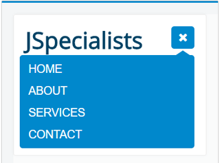
/* ==========================================================================MOBILE NAVIGATION STYLES========================================================================== */.mobileNavOpen .nav { position: absolute; right: 0px; top: 50px; width: 100%; display: block; background-color: #0088cc; border-radius: 5px; padding: 5px;}
/* Creates the triangle at the top of the menu */.mobileNavOpen .nav:before { content: ""; width: 0; height: 0; border-style: solid; border-width: 0 15px 10px 15px; border-color: transparent transparent #0088cc transparent; position: absolute; top: -8px; right: 5px;}.mobileNavOpen .nav li { width: 100%; margin: 0px !important; }.mobileNavOpen .nav li a { font-size: 1.4em; text-transform: uppercase; color: #fff; }.mobileNavOpen .nav li a:hover { border-radius: 5px; color: #0088cc; }
Next up …. CSS to show the button
CSS to show the Mobile Button and hide the menu.
We will now create the CSS which will display the Mobile Button, and hide off the Navigation. The following styles will need to be added to the stylesheet/media query associated with the viewport/device you are wanting the Mobile button to show on.
.mobileNavButtonWrapper { display:block; } /* Displays the mobile button */ .nav { display: none; } /* hides off the navigation */
An example of a media query that would alter the styles on devices with a min-width of 120px and a max width of 479px would look like this
@media only screen and (min-width: 120px) and (max-width: 479px) {// CSS GOES HERE LIKE THIS.mobileNavButtonWrapper { display:block; } /* Displays the mobile button */.nav { display: none; } /* hides off the navigation */ }
And we are done!
Extra tips and things to takeaway
If you have a complicated menu, with multiple tiers, then you can still use the above method … but will need to add in some extra jQuery/CSS to add a button in to show/hide the other tiers, as don’t forget there is no hover on devices!
- You don’t need to use a ‘custom module’ that code could be added into your template directly.
- Don’t forget, you may to to tweak some of the CSS in this demo to work with your template and setup!
- Need help creating your triangle, no problem, there is an online css triangle generator!
- CSS and jQuery are both powerful tools, many animations can be applied in both … so why not have a play and see what you can come up with!